> ## Documentation Index
> Fetch the complete documentation index at: https://archie.com/docs/llms.txt
> Use this file to discover all available pages before exploring further.
# Theme
> Pick a complete, pre-built visual direction for your app, or generate new alternatives — each one comes with a written rationale.
Theme is the fastest way to set every design value at once. Instead of picking a color, then a font, then a corner radius one at a time, you choose a complete look that Archie has already put together and validated.
## Choosing a theme
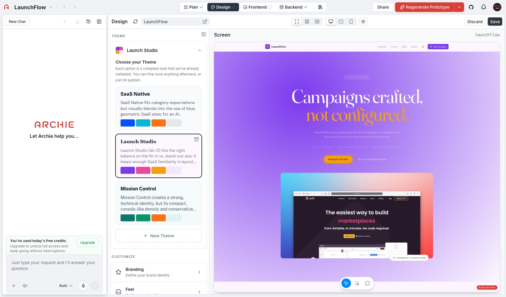
Each theme option is a full package — palette, typography, motion, and density — bundled into one card. Click a theme to apply it. The generated screens in [Screens](/docs/features/design/screens/overview) update immediately.
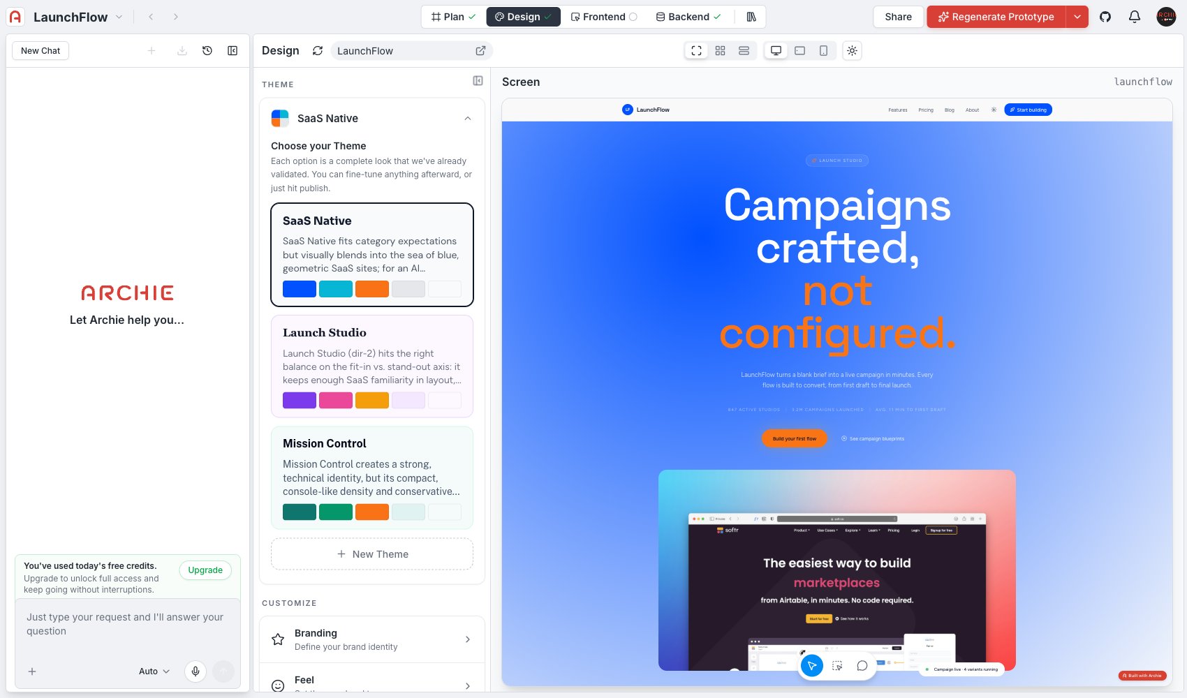 Every theme ships with a short written rationale explaining the reasoning behind it: why that palette, why that type pairing, and how it positions your app relative to competitors in the same space. Read it before picking — it tells you what the theme is optimizing for, not just what it looks like.
 ## Generating alternatives
Click **New Theme** to generate additional options beyond the ones Archie starts you with. Each new theme explores a different point in the design space — for example, one alternative might keep the same brand positioning but swap a light, editorial look for a dark, high-contrast one.
## Archiving a theme
Themes you are not considering can be archived to keep the list focused. Archiving does not delete anything you have already applied — it just removes the option from the picker.
## After you pick a theme
Selecting a theme sets the starting values for every other section in this part of Design:
* [Branding](/docs/features/design/branding)
* [Feel](/docs/features/design/feel)
* [Read](/docs/features/design/read)
* [Color](/docs/features/design/color)
* [Polish](/docs/features/design/polish)
Fine-tune any of them afterward — picking a theme is a starting point, not a lock-in. Changes you make in those sections do not create a new theme entry; they adjust the underlying values directly.
## FAQ
Switching to a different theme resets those values to the new theme's defaults, overwriting manual adjustments you made in Branding, Feel, Read, Color, or Polish. Pick a theme close to what you want before fine-tuning.
Archie generates a small starting set tailored to your blueprint's positioning. Generate more with **New Theme** whenever you want to explore a different direction.
## Generating alternatives
Click **New Theme** to generate additional options beyond the ones Archie starts you with. Each new theme explores a different point in the design space — for example, one alternative might keep the same brand positioning but swap a light, editorial look for a dark, high-contrast one.
## Archiving a theme
Themes you are not considering can be archived to keep the list focused. Archiving does not delete anything you have already applied — it just removes the option from the picker.
## After you pick a theme
Selecting a theme sets the starting values for every other section in this part of Design:
* [Branding](/docs/features/design/branding)
* [Feel](/docs/features/design/feel)
* [Read](/docs/features/design/read)
* [Color](/docs/features/design/color)
* [Polish](/docs/features/design/polish)
Fine-tune any of them afterward — picking a theme is a starting point, not a lock-in. Changes you make in those sections do not create a new theme entry; they adjust the underlying values directly.
## FAQ
Switching to a different theme resets those values to the new theme's defaults, overwriting manual adjustments you made in Branding, Feel, Read, Color, or Polish. Pick a theme close to what you want before fine-tuning.
Archie generates a small starting set tailored to your blueprint's positioning. Generate more with **New Theme** whenever you want to explore a different direction.