

Primary
The action color for your app — used for primary buttons, links, and other elements that mean “do this.” Set separately for Light and Dark, each as a hex value.Neutrals
Neutrals are the grays used for backgrounds, borders, and body text — the colors that show up everywhere but are never the star. Choose the temperature:- Cool — feels technical.
- Neutral — balanced, no strong lean.
- Warm — feels human.
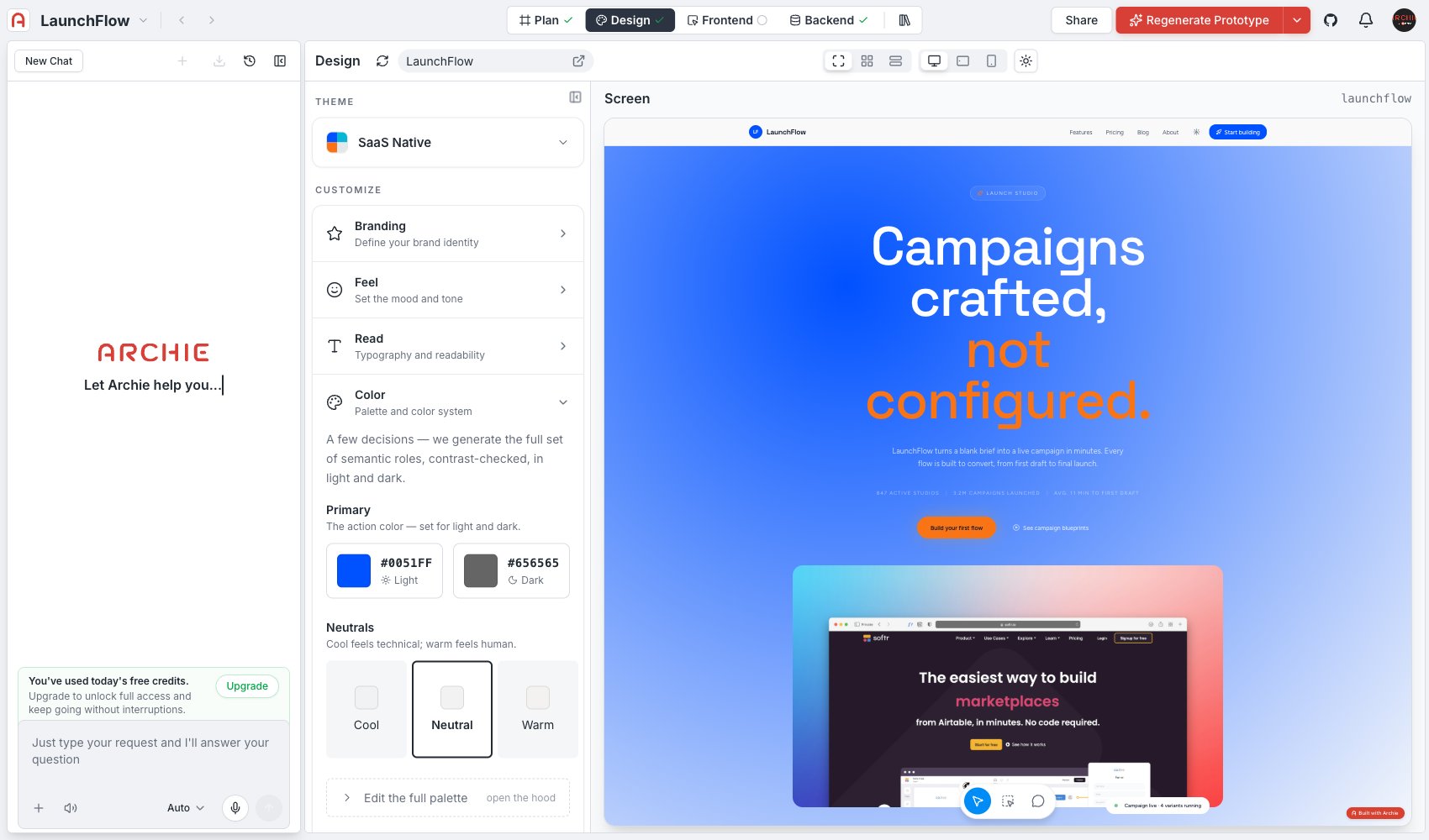
Advanced editing
Click Edit the full palette to open every generated semantic color role directly — surface, content, status colors, and so on — instead of deriving them from Primary and Neutrals. Use this when the automatic derivation gets close but you need to nudge a specific role.FAQ
Why can't I just pick every color myself?
Why can't I just pick every color myself?
You can, through Edit the full palette. The Primary + Neutrals flow exists because deriving a full, accessible palette from two decisions is faster than picking a dozen shades by hand, and Archie checks contrast for you along the way.
Does the palette meet accessibility contrast requirements?
Does the palette meet accessibility contrast requirements?
Yes — the generated roles are contrast-checked in both light and dark mode as part of generation.